| data visualization | ||||
| SARC5400 | Eric Field [emfield@virginia.edu] | |||
| T 7:00-9:30pm | Campbell Hall 158 | |||
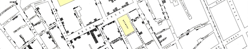
In September 1854, London experienced a severe epidemic of cholera. By creating graphics that mapped the information available in a clear and spatial manner, Dr. John Snow was able to identify the cause and stop the disease.1
In January 1986, the space shuttle Challenger exploded during launch due to a failure of O-rings under low temperature. Had the data - which was available - simply been presented differently, the launch may arguably not have occured, saving the craft and crew.1
This is a class about information and data visualization.
We live in a world rich with information. This course concentrates on the identity and role of information in our environs: in language, in the buildings and cities that we inhabit, in our expanding communications networks, in science, medicine, economics, art, politics; and in the tools and technologies we create to help us navigate, understand, and collaborate on the problems that we face.
Science and technology, including the building sciences, environmental sciences, and political sciences, make a ton of information available to us. We can model, map, and simulate almost anything, and produce multitudes of data.
But most of us don't understand `data`. We need to see it. We need to visualize it — contextualize it, draw its relationships, and envision the scenarios surrounding it — to make effective decisions. Too often, though data is available, we don't use it or misuse it, because it lacks context and meaning to understand. We understand better if we make it visual.
This class is about using visual and spatial thinking to construct information - to find, indeed invent, approaches toward seeing, envisioning, and understanding - to make better informed decisions about the problems of our world. To do this we will study — and make — useful, compelling, and beautiful information visualizations.
With a dual focus on content and craft, this course will look both theoretically and practically at how we build information, why, and how we use and populate it in our world. We will study language, graphics, and urban form as dialects of `information space`, while we learn and experiment with both existing visualization software and custom HTML5/interactive web programming as vehicles to build new architectures and interfaces that use, visualize, and analyze information well.
At the end of the semester, each student will take on a case study using their own data for a final visualization project, using data from natural, scientific, economic, cultural, and/or human-behavioral pressures. Projects will produce and extract insight from visualizations built from this data, using the tools of the class.
Through the class, we will develop techniques and tools to see and understand complex issues at multiple scales, to effect change and create impact.
1 Edward Tufte, Visual Explanations